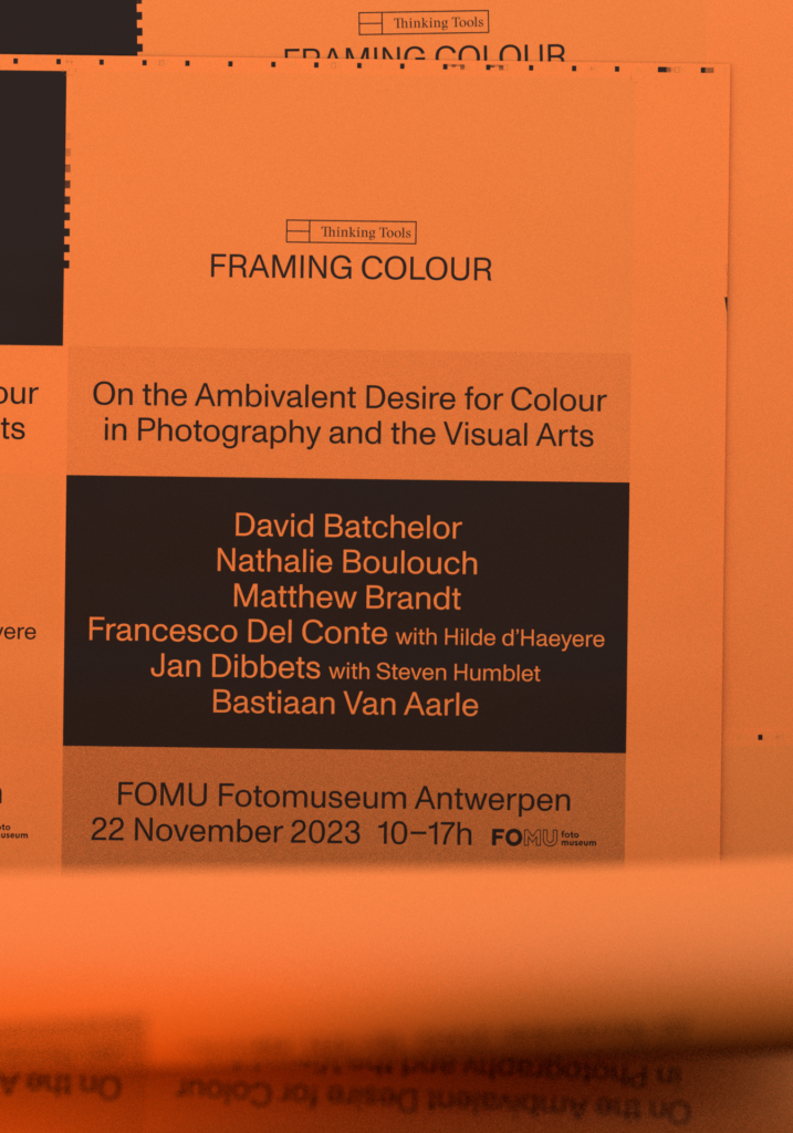
Framing Colour: On the ambivalent desire for colour in photography & the visual arts
When photography was first introduced in 1839, it lacked a vital component: colour. The absence of colour was no accident, given that the photographic system is in essence achromatic. Several attempts were made to add colour to this new medium, each relying on lithographic, optical, chemical or digital interventions. This led to a distinct difference in the way colour operates in technical images. Being produced by external forces, colour is always an artificial addition to the photographic process. The symposium Framing Colour: On the ambivalent desire for colour in photography & the visual arts aims to explore the effects of this particular predicament. Through a series of talks by art-historians and artists, the symposium hopes to shine a light on the different technological procedures used to create these colourful images and analyse how they articulated new ambitions for photography. Understanding colour not as just a surface phenomenon, but as an integral part of the structure and meaning of photographs and artworks, we invited contemporary artists to discuss their specific interest in colour. As such, the symposium also peers into the fraught cultural and aesthetic histories that arose with the introduction of colour photography. The invited speakers are: David Batchelor (UK), Nathalie Bouloch (FR), Matthew Brandt (USA), Franceso Del Conte (IT), Hilde D’haeyere (BE), Jan Dibbets (NL) and Bastiaan Van Aarle (BE).
Schedule
10.00-10.30 Introduction by Steven Humblet
10.35-11.25 Nathalie Boulouch: Wavelengths and potato starch: turning points and debates in colour photography
11.25-11.40 Break
11.40-12.30 Matthew Brandt: Toxic Colours
12.30-13.00 Bastiaan Van Aarle: Moving Mountains
13.00-14.00 Lunch break
14.00-14.50 David Batchelor: Colour as a Noun
15.00-15.50 Jan Dibbets (in conversation with Steven Humblet)
16.00-16.50 Francesco Del Conte (in conversation with Hilde D’haeyere): The representation of colour within the photographic medium
17.00 End
Nathalie Boulouch (FR)
Wavelengths and potato starch: turning points and debates in colour photography
Considered an “objective” medium to record reality, photography faced a problem when it was invented: it lacked colours. The period between the middle of the 19th century and the first decade of the 20th, offers a good viewpoint from which to study the question of reproducing colour in photography. I propose to focus on the period between 1891 and 1907: that is, between the invention of the interferential process of colour photography by the French physicist Gabriel Lippmann and that of autochrome by the industrialists Auguste and Louis Lumière. These two processes record colour in photography in a completely different way. While Lippmann sought to capture a colour image directly, the autochrome drew attention to the reproduction of colour by additive synthesis. If the ways of recording colours differ, the photographs obtained will find common means of visualization: projection. Projection which produces an immaterial, temporalized and spectacular image for a collective sharing of images, is indeed at the heart of the diffusion of colour photography. Three-dimensional objects asserting their materiality, interferential photographs and autochromes only exist as images through the effect of the light of the projector, which gives them their dimension of a luminous “painting”.
Nathalie Boulouch is a lecturer at Rennes 2 University (France) and curator. She teaches and researches history of contemporary art and history of photography. She has written numerous essays and has curated exhibitions on historical and contemporary photography in colour.
Matthew Brandt (US)
Toxic Colours
Colour photography provides a genuine window into our world, with colour being more than just a surface feature; it’s a fundamental element of their inherent structure. However, what occurs when this apparently stable but hidden colour framework is transformed by natural forces, such as water, fire, or earth? In this presentation, we’ll delve into the world of natural photographic colour systems and how my work challenges their boundaries. Specifically, we’ll examine the significance of colour in my work, particularly in the Lakes and Reservoirs series. I’ll demonstrate the diverse approaches I’ve employed to explore the enigmatic nature of colour photography.
Matthew Brand is a photo-based contemporary artist based in Los Angeles. He is renowned for his innovative approach to photography. Born in Los Angeles, California in 1982, he is celebrated for his unique methods, often incorporating unconventional materials and processes into his work. Brandt’s pieces have been exhibited globally, and in numerous institutional collections.
Bastiaan Van Aarle (BE)
Moving Mountains
In his works, Bastiaan van Aarle challenges our notion of time and movement by choosing choosing a medium and a subject that epitomizes stillness. For his series Moving Mountains he took several photographs of the same mountains—all from a similar point of view, but spread over a certain period of time. As a result, these monuments of immutability, seemingly start to shift and reveal a movement that we can’t experience ourselves: the rotation of the planet in space. Taking inspiration from color photography’s beginnings, van Aarle transferred the different images to cyan, magenta, yellow and black. When brought together again, they reveal subtle traces of the passing of time in colored tinges. The effect is so otherworldly that it feels as if the rocks exist in a different dimension—as if the soft hues come fuming from the mountain’s deepest history, floating gently in the thin mountain air. What is revealed here about the world is only exposed in the image, it can neither be conceived beforehand nor be seen with the mere eye.
Bastiaan Van Aarle is a Belgian photographer, exploring the boundaries of photography, its medium-specific properties, and how these relate to the perception of reality. He is especially interested in the transformative qualities of light, be it through invasive advertising panels or the White Nights of the North.
David Batchelor (UK)
Colour as a Noun
Colour has been the central preoccupation of my work for over thirty years. But, while much of the two- and three-dimensional work I make is brightly coloured, it has never been my aim simply to make colourful works. Rather my concern is to make colour its own presence in a work, to make works that in one way or another are colour: colour as a noun rather than colour as an adjective. Given that in any work of art or design colour is always supported by certain materials and usually inhabits particular shapes and forms, colour can never entirely free itself from those constraints. In this sense colour can never be entirely autonomous. But it can perhaps be pushed in that direction, pushed to the point where colour becomes primary, and shape and form secondary. This possibility would represent a reversal of the conventional Western hierarchies in art, in which line, shape and form are deemed central to meaning and value in art, and colour is regarded as peripheral, at best, and, at worst, a dangerous distraction. In this talk I will discuss the various ways in which I have tried to address colour in my two- and three-dimensional work. In particular I will refer to a number of illuminated works I made in the early 2000s, as well as more recent experiments in sculpture, painting, photography and textiles.
David Batchelor is an artist and writer based in London. For over thirty years Batchelor has been concerned with the experience of colour within a modern urban environment, and with historical conceptions of colour within Western culture. His work comprises sculpture, installation, drawing, painting, photography and animation. He has exhibited widely in the UK, continental Europe, the Americas and, more recently, the Middle East and Asia. Batchelor has also written a number of books and essays on colour theory, including Chromophobia (2000).
Francesco Del Conte (IT) in conversation with Hilde D’haeyere (BE)
The representation of colour within the photographic medium
Since its inception, the photography industry has attempted to emulate reality most accurately. Yet, colour is a complex visual sensation that can only be approximated by technological devices. Within photography, chemical and digital technologies approach the idea of colour through very different means: the former with filters and dyes embedded in the photographic emulsion; the latter with codecs, algorithms that translate into hues the photons recorded by the sensor. How do such different photographic technologies see the colours around us? What remains of the chromatic heritage left by past technologies? For instance: when a certain photographic film is discontinued, (how) is it still possible to communicate about those extinct colours? These and other questions are at the core of Del Conte’s research project The Chromatic Illusion within the Photographic Universe, started in September within the Thinking Tools research group.


